Which car has the best infotainment system?
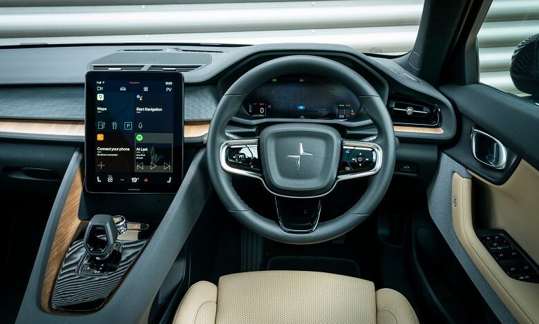
Connecting your phone, scrolling through hundreds of comfort options or simply putting on your GPS: there are so many options hidden behind the central screen of your car. But which infotainment systems are the best?
The infotainment screen is the centrepiece of your car’s interior. As a source of music or traffic updates, for operating your car’s comfort functions or even as a conversation partner via voice control. They also come in all colours and shapes.
Horizontal or vertical screen, large or small, one or two screens, with or without physical buttons, but what makes an infotainment system good?
Ergonomics
The technical term is ergonomics: the user-friendliness of the system. For example, a few physical buttons for the most important functions (such as air conditioning or windscreen and rear window heating) are quite helpful. After all, you often use them while driving, and then you don’t want to scroll through many menus. However, too many buttons prevent you from seeing the proverbial forest for the trees.
The shape of the screen is, of course, also important. The higher placed, the easier it works. And we feel we prefer a horizontal screen rather than a vertical screen, although we also get along well with the new Ford Mustang Mach-E system.
And we haven’t talked about the possibilities yet. At Jaguar-Land Rover, you can set the seat heating and massage via a separate screen. Nice, but not always handy. At Mercedes, a Virtual Reality application helps the GPS. Many brands offer smartphone connectivity, but not always and everywhere. And then you have the operating speed, the graphics, the menu structures, personalization options, …
Top five of the best infotainment system
1. Mercedes
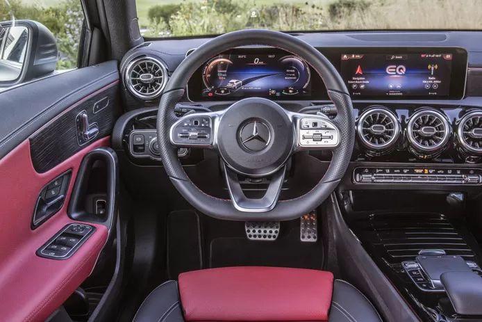
In terms of infotainment technology, the MBUX system from Mercedes is at the top, in our opinion. Graphically it is more than good, the menus are logical, and you can also personalize the screen. The voice assistant is also one of the better on the market.
2. Audi
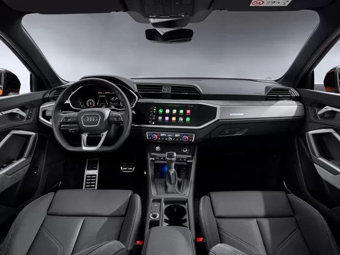
At Audi, we like the infotainment of the smaller models, such as the Q3, on the other hand: graphically clever, especially the GPS with Google Maps functions, but unlike the larger models, also with physical buttons for the most important functions.
3. Kia
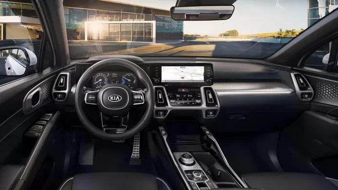
Kia always had touchscreens that responded well to our commands and were always graphically in order, but the South Koreans switch a step higher with the new Sorento. Graphically superb, with a few more physical buttons and equipped with numerous comfort functions.
4. Polestar
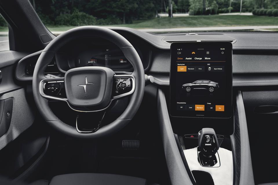
We also find our thing with the Polestar 2: thanks to the collaboration with Android, the possibilities are almost endless, with apps such as Spotify that are immediately available, the menus are well put together, and although there are no physical buttons, you can immediately access the most important functions. The Google Voice Assistant is also easy to use. Only you operate the upright screen of the Polestar less easily.
5. MINI
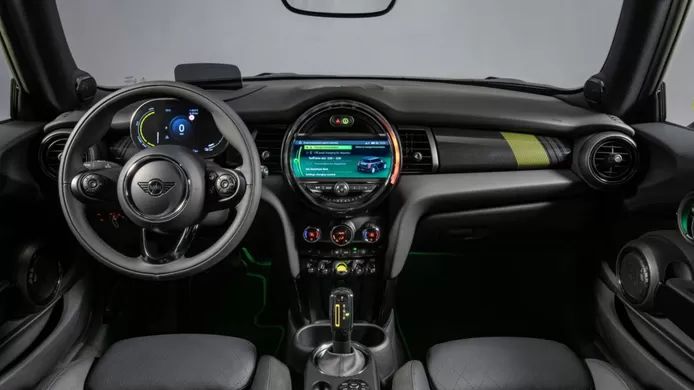
Finally, we also give a compliment to MINI for how the brand glues past and present together. The central display is where the tachometer used to be in previous MINIs, the arc around it lights up when operating the air conditioning, and the start button is a clever switch, perfect for a retro car like this one.


