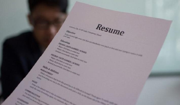
These are the best and worst fonts for your resume

The font of your resume is more important than you may think at first. It determines the first impression a recruiter, HR manager, or employer has of you. How do you choose the right font? We list the best and worst fonts for your resume to give you a helping hand.
Here’s what to keep in mind when choosing a font for your resume.
Best fonts for your resume
Are you applying to a large company? More and more companies are using a software system to speed up the selection process. Do you suspect that the company you are applying for uses such an Applicant Tracking System (ATS)? Then go for a font that the system can read well.
It concerns the following fonts:
- Georgia
- Times New Roman
- Verdana
- Helvetica
- Cambria
- California
- Arial
- Tahoma
- Gill Sans
- Garamond
You can never go wrong with these fonts because they are legible for “robots” and humans. You could still choose other legible fonts if you assume that an ATS will not view your resume.
What should you consider when choosing a font for your resume?
An old-fashioned (and boring) Word document is no longer of this time. Resumes are looking more and more professional and creative. It can therefore be tempting to go for creative fonts on your resume as well. After all, you want to stand out from the employer.
The do’s and don’ts for a creative resume that stands out
We get that. But you do want to make a good impression. Even more important than whether you stand out is that your font (and CV) looks professional and whether it is easy to read. You can distinguish yourself from the other candidates by the content of your CV. Make sure your font doesn’t distract from that.
Tips
- Ask friends and family what they think of your resume. This is nice in terms of the readability of the font and the entire look & feel of your resume.
- Customize your font for the type of company you’re applying to. An established corporate company will appreciate it if you stick with Times New Roman or some other classic font. With a creative start-up, you have a little more freedom in this. But: still, make sure it looks professional and legible.
Worst fonts for your resume
If all goes well, these fonts should no longer come as a surprise to you, but you probably also want to know which fonts you should stay away from. These are, of course, unprofessional and childish fonts. It is also better not to choose separate “design” fonts that you like (but may be difficult to read) for your CV. We give a few examples:
- Comic Sans
- Papyrus
- Wingdings
- Marker Felt
- Chalkboard
One last tip: if you have to download a font from the internet to use it, you’d better skip it. Go for one of the standard fonts on your computer.


